Proposal Photos

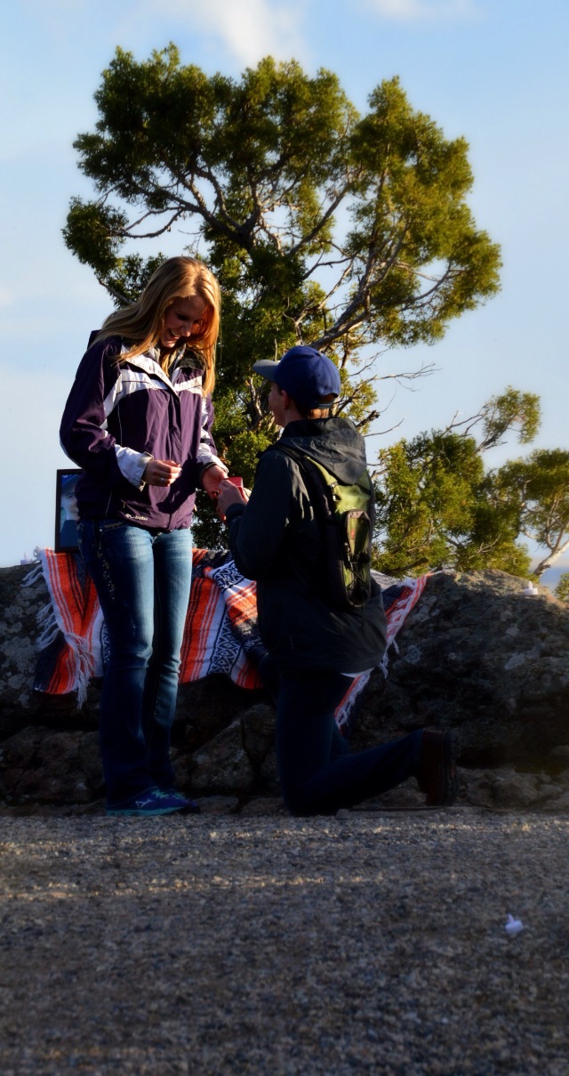
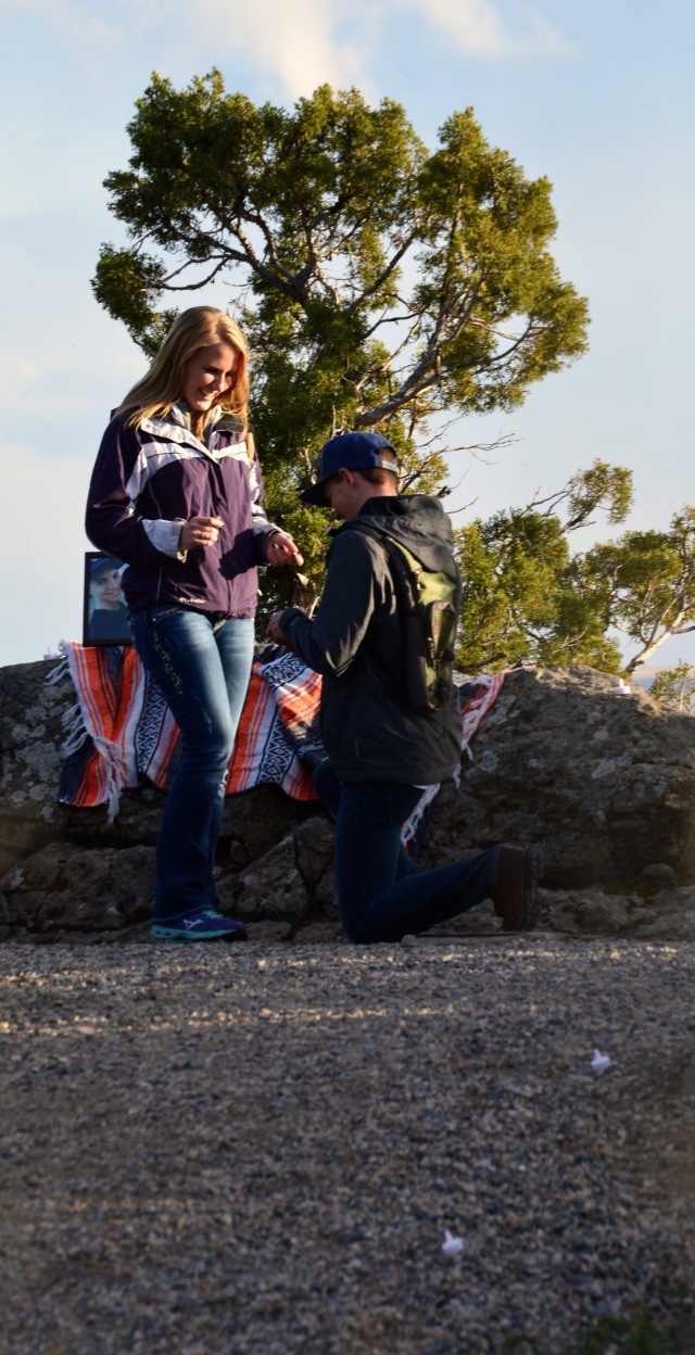
On a beautiful evening overlooking the snake river valley, my friends Erikka and Nate got engaged. The moment was great (from a distance), The sunset was gorgeous, And the photos turned out great. Congrats! I hope your marriage is as happy as you are in these photos. 


Comm 130- Portfolio

Project Corrections: I spent most of this time working on my logos. I changed all of the fonts to better contrast each other. I also edit the colors on the bottom logo. I darkened the original color to make it look less “boise state”. I created these logos for an actual business. The client wanted these changes so I did it!  I also spent some time on my business card. I shrunk the font size and changed a few other small details. I spent about 2 hours.

Message: I wanted to display my hard work over this semester. I chose a relatively simple design for the portfolio to keep the focus on my projects.

Audience: Potential employers or clients

Top thing I learned: Master Pages and Paragraph Styling

Future Application of Visual Media: I will apply visual media to any job or calling I have. I feel that I have learned so much in this class, and I understand what makes a good design so I will look for ways to share this new talent.

Color Schemes and Names: Blue and Brick; Complementary

Title Font and Category: News Gothic Regular; Sans seriff

Decorative Font and Category: Pea Hannah Rocky Road; Script Handwritten

Thumbnails and Source of photo used

flickr.com: https://c2.staticflickr.com/4/3059/3035349976_e003c7a2fb_b.jpg

letters

Comm 130- Brochure Project

FrontP9-JessicaChatterton-Outside

InsideP9-JessicaChatterton-Inside

BackP9-JessicaChatterton-Back

Description:

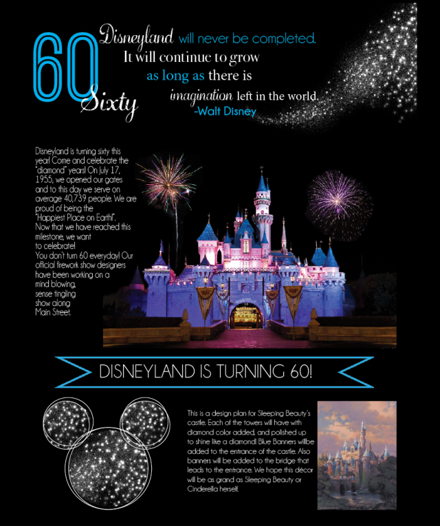
A two sided (duplex) folding brochure with a gate fold.

Process:

The first step of this brochure was creating a sketch of my brochure. I decided to go with a gate fold brochure on a 8.5×11 page in InDesign. I then set the rulers to 2.72 on the sides and then began the process! I started on the inside of my design. I first wanted the brochure to open up and boom! The magical Castle! So I chose a photo of the castle at night and opened it in photoshop. I added two photos of fireworks in the background to add even more magic! After this, I added my body copy and used a text wrap around the castle. I next added the bottom section of the inside. I added a paragraph and photo of the design for Sleeping Beauty’s Castle. On the other side of this section, I added a series of circles to create “mickey” ears. I added the sparkle detail later. Then the top section, I placed a quote from Walt Disney, and a 60. I used three different fonts, sizes, and colors.

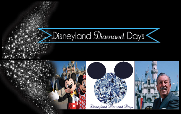
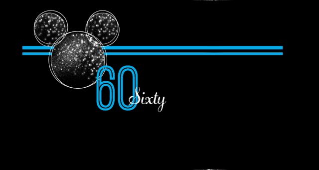
The other side came next. I found two photos from Disneyland. One modern, and one from when Walt Disney was alive. I placed my logo in the middle of those two photos. I then added a sparkle trail and title text on the bottom and top front side. On the back I used the same “60”, mickey ears, two blue lines, and the “Sixty” on the back.

Programs:

Photoshop, InDesign, Illustrator

Message:

To Inform any Disney lover that Disneyland is celebrating it’s 60th birthday!

Top Things Learned:

How to create a creative fold in Indesign.

Color Scheme:

Blue; Monochromatic

Title font: Champagne and Limousines- Sans Serif

Decorative Font: Diamond Dust- Script

Word Count: 290

Video: https://www.youtube.com/watch?v=Y7vu87_3flk

Thumbnails:

disneyland-castleMMSleeping-Beauty-Castle-Decor-Diamond-Celebration-DisneylandWaltDisneyfree-fireworks-image-1free-fireworks-image-7magic_dust_02_by_nighthawk101stock-d4ek3sq

Links Used:

http://app.emaze.com/@AOZCTOOF/walt-disney-by-dareen#1

http://www.iceflowstudios.com/2013/freebies/over-100-free-fireworks-pictures/

http://www.disneyeveryday.com/disneyland-turns-60-find-out-how-they-are-going-to-celebrate/

http://background-kid.com/disneyland-castle-wallpaper.html

http://galleryhip.com/sparkle-trail-png.html

Comm 130- Webpage Project

Screen Shot 2015-03-14 at 3.23.45 PM

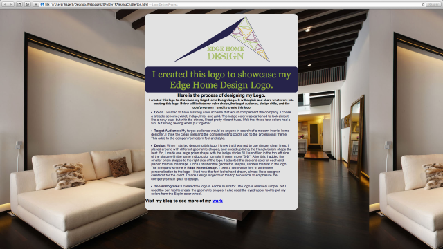
Description: A web page designed to showcase a personally created logo.

This was my first time creating anything in html or css. I created this web page using only TextWrangler on the Spori Lab Macs. I created my logo in Illustrator. I played around with different geometric shapes, and ended up liking the triangle/prism shape the best. So, I made one large prism shape with the indigo stroke fill by using the pen tool. I also filled in the top left side of the shape with the same indigo color to make it seem more “3-D”. After this, I added the smaller prism shapes to the right side of the logo. I adjusted the size and color of each and placed them in the shape. Once I finished the geometric shapes, I added the text to the logo. The company’s name is, Edge Home Design.  I used a decorative font to add some personalization to the logo. I liked how the font looks hand drawn, almost like a designer created it for the client. I made Design larger than the top two words to emphasize the company’s main goal; to design.

My message is Edge Home Design is a modern interior design company that can make any space look nice!

The audience is anyone looking for a interior designer.

The top thing I learned was how to change css details in a webpage.

Color Scheme: Tetradic…. Indigo 27244A, Violet 6A1E49, Gold CA9E0A, Lime 90AE3E.

Font: Cash Currency- Script/ oldstyle

I changed the font families, the colors to match my logo, and added a background image.

Comm 100- Weekly Websites 6-10

Week 6- Aaf.org

  1. Beth Hendrick, from BYU-Idaho, is a current member of the Idaho Falls Chapter of AAF.
  2. BYU-Idaho has a College Chapter – We are in District 11. A great way to network in Rexburg or Idaho Falls. Students can enter the big contest and can win large prizes.
  3. The website has many Principles and Practices for Advertising Ethics listed to view.
  4. They host several events for the practicing members of the chapter

Week 7- byui.edu/gradplan

  1. Search button allows you to search catalog using course title or number. This is helpful once you understand it more once you get going.
  2. There are Links to campus directory on the actual app.
  3. Purpose of Grad Plan is to explore options and plan path for graduation from BYUI.
  4. The elective tab unlocks all of the classes that are available and you can drag and drop from this list.
  5. Buttons to see what other degree options are available

Week 8- byui.edu/business-communication

  1. The College of Business and Communication at Brigham Young University-Idaho creates an environment that allows students to flourish and grow spiritually, personally, and professionally.
  2. The majority of all information that you could ever need is on the page. Including the mission statement and purpose.
  3. The college is sponsored by private businesses each semester, called a summit.
  4. Contact Information for the main professors/ admins and the academic discovery center- The College of Business and Communication Academic Discovery Center Office: 227 Smith Building
  5. A list of all of the societies communication and business majors are listed.

Week 9- http://www.office.microsoft.com

  1. The site has super cool templates that you can use.
  2. You can get an app for ipad with office to view documents
  3. There is a lot of information about learning how to use the programs easier.
  4. They have a blog listed on the site that is for the help of their customers/ users.
  5. There are links to helps for both business & home use

Job specific questions

Week 10- jobinterviewquestions.org

  1. On the site, they list the main questions that are asked in an interview.
  2. Top Interview Questions Top Reasons persons don’t get the job – candidate cannot articulate themselves, aren’t prepared, or are too nervous.
  3. To control nerves strike a super hero hold for 2 minutes and pretend you are a champion before you go in for the interview.
  4. They have a downloadable interview guide that can come in handy!
  5. To become a better interviewer, have confidence! Use your strengths to make yourself seem more appealing! Go for it!

Comm 100 Class Notes

Comm 1/15

Soap Box: There are loads of opportunities for different people with different talents!

Advertising, graphics, video, research, PR

Real agency, Real clients

Soapbox.net

Scroll: No experience needed.

Experience comes and exposure

Scroll TV/ Upper valley Idaho: Experience isn’t needed… Upper valley has feature stories, on Channel 8

LIKE THE COMM FACEBOOK PAGE

Emily…something or other…. Joined scroll and got a job at the Standard Journal became editor in chief. Started working at Deseret News after she graduated. She wrote a 24 page special on Carl Bloch’s exhibit.

Comm 1/22

Journalism “more important than we think”

Brother Williams

4-5 years ago journalism was in trouble because technology hurt it.

Comm majors should consume communications and news

Local news 8, the marshall project, pro publica, the daily signal,

Facebook: we share…. Personal, Real, Relevant

Microsoft Hologram Glasses are sweet!

Put your best work on your blog!!!!!!

Comm 1/29

Brother Howard

Video Production- Many jobs

90 Second Story- 90 seconds is the average to jam pack material.

Directors, producers, editors, videographers, graphic artists, sound engineers, lighting..

Median salaries- 35,000-58,000

Put real world content in your portfolio

Comm 2/5

Sister Esplyn

Visual Media- Photos- Video- Web Design

All comm majors should have a knowledge of visual media!

“ESV Factor”…Efficient, Skilled, Versitile

Why Comm/ visual media majors are hired… Website, Adobe skills, graphic design, web design, photography and editing, wordpress, KLOUT score(social media efficiency)

Tips to get a job .. Pray, timing and connections, make it happen, custom resumes, unpaid internships, network!, have faith, be positive.

Comm 1/11 PR is EDUCATING those around your company.

Join Prssa

PR teaches people… The Church, “ I’m a Mormon” temple open houses..

PR people have to be able to write!

The process is: Source…Encoding…Message…Channel…Decoding…ReceiverYou need to be good to the public

Lobbying is a part of PR for the government helping

Work at PR/ Ad Firm or for an organization

2/ 19 Advertising: sister Hendricks

Tip: Take a marketing Class: Product, Price, Place, Promotion, People.

There are so many different typed and ways of advertising.

Types of advertising agencies: full service, business to business, creative boutiques, media-buying services, interactive, In-House.

Many opportunities that come from advertising.

Comm230, 330, 322, 380,385,430

2/26/15  Brother Christensen

The Grad plan software is not perfect, but going to the center will help overcome that.

Go to the Grad plan day to get card checked off!

3/5/15 Brother Cole

Ethics: what is right or wrong; moral.

Wordsmiths value morality and the written word.

Libraries started in the 3rd century- Library of Alexandria

1709 when law is made to protect written word… 1716 plagiarism is made

Copy right lastsfor 70 years. It used to be 14 years.

You can use material in a class room, and a small portion of the material can be used without permission


Comm 130- Stationary and Business Card Project

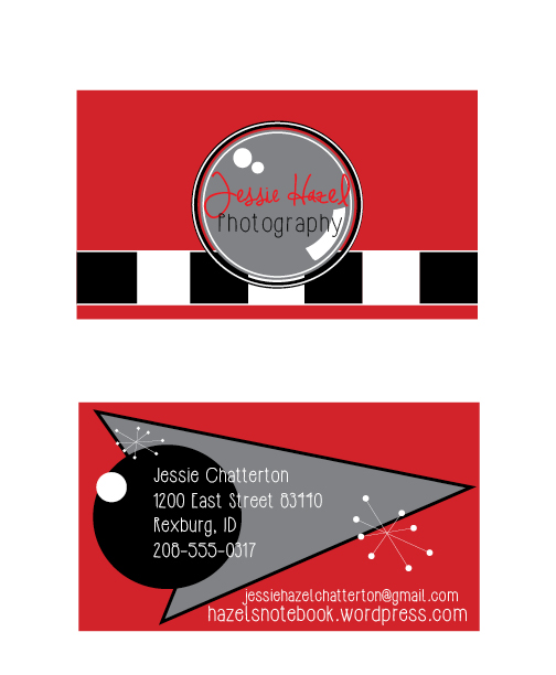
P6-Jessica Chatterton P6-JessicaChattertonP6JessicaChattertonCard Large

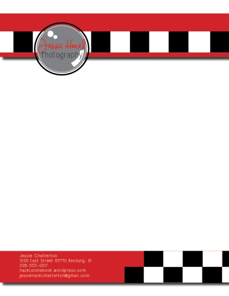
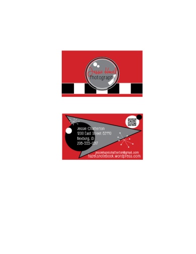
Matching letterhead and business card designed using a personally created logo.

This project started off as a challenge for me, but over the work period I learned to like it. I first started by making a new logo in Illustrator. I used a series of elipses to create a “camera” look. Then I added a shape in the center circle to make it look like a camera lense. I next added my Text. I used Red and Black because they stand out well together. After I finished my logo, I started on my letterhead. I started off with some retro lines, but I decided to go with the repetition of the repeating squares. This also added to my vintage retro look. I added a drop shadow to my red boxes at the top then I added my logo. The bottom  was created with a red rectangle with drop shadow, the same repeating squares, and a text box. Next came the business card, I wanted the front of the card to look like a camera. So I added those same repeating boxes, and then placed the logo in the center to look like the lense. I used the pen tool to create to arrow shape on the back side, and also used the elipse tool to create the circles. I added my personal information and then added my QR code.

Message: Jessie Hazel Photography is a fun, creative photography business.

Audience: Anyone who is looking into photographers.  

Top thing learned: sometimes, less is more.

Color Scheme: Red Monochromatic’

Title Font: Jennifer Lyn: Script

Body Font: HipsterIsh: Sans Serif

Comm 130- Logos Project

Jessica-Chatterton-P5Logos

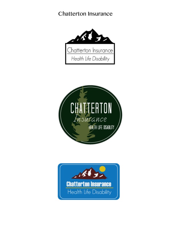
Three logo variations for the same company.

For this project, I wanted to make three new logos for Chatterton Insurance and I used Adobe Illustrator. The first logo started out with a rectangle drawn with the rectangle tool. Then I used the pencil tool to create the outline or shape of a mountain range. I moved the box to the bottom of the mountains and then added the text. I used the same font for both lines. Lastly I added the line to separate the two.

For the next logo, I used the Elipse Tool to create a large Forest green circle. I added a second elipse with a smaller stroke size and white color. Next, I used the Pencil tool to create the outline of pine tree, and gave it a lighter green color. Lastly, I added the text. I used two different fonts to have contrast between the two.

The Last, started with a rectangle with rounded edges made by the rectangle tool. I used the same mountains from my first logo, but changed the color of the mountain and the snow detail. I added a bold text and a thin text to have contrast between the two. And lastly I added a gold Elipse and a gold line in between the text.

Chatterton Insurance is an Idaho business that can provide Health, Life, or Disability insurance.

Anyone interested in insurance.

The top thing I learned was how to use the Pen Tool and Pencil Tool to create unique and hand drawn shapes.

Color Schemes:

Complementary: white and black

Monochromatic: Green

Split Complementary: Brick, Gold, Blue

Logo 1 Title Font: GeoSans regular, Body Font:GeoSans

Logo 2 Title Font: Tall Dark and Handsome Condensed, Body Font: Fely

Logo 3 Title Font: Haettenschweiler, Body Font: GeoSans Light

Votes on my logos

Top Logo 4… Middle Logo 7… Bottom Logo 2.

My favorite logo is the middle.