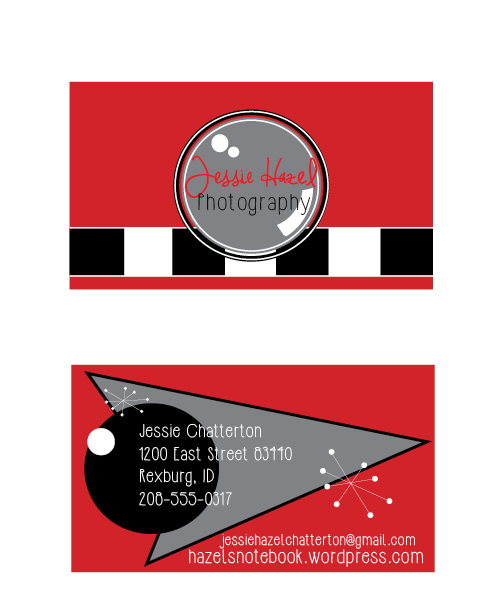
Matching letterhead and business card designed using a personally created logo.
This project started off as a challenge for me, but over the work period I learned to like it. I first started by making a new logo in Illustrator. I used a series of elipses to create a “camera” look. Then I added a shape in the center circle to make it look like a camera lense. I next added my Text. I used Red and Black because they stand out well together. After I finished my logo, I started on my letterhead. I started off with some retro lines, but I decided to go with the repetition of the repeating squares. This also added to my vintage retro look. I added a drop shadow to my red boxes at the top then I added my logo. The bottom was created with a red rectangle with drop shadow, the same repeating squares, and a text box. Next came the business card, I wanted the front of the card to look like a camera. So I added those same repeating boxes, and then placed the logo in the center to look like the lense. I used the pen tool to create to arrow shape on the back side, and also used the elipse tool to create the circles. I added my personal information and then added my QR code.
Message: Jessie Hazel Photography is a fun, creative photography business.
Audience: Anyone who is looking into photographers.
Top thing learned: sometimes, less is more.
Color Scheme: Red Monochromatic’
Title Font: Jennifer Lyn: Script
Body Font: HipsterIsh: Sans Serif


Hey Jessie, your designs turned out fantastic! My favorite is the side of your business card that looks like a camera and the font that you used for your name. The black and white checkerboard make good repetition throughout each piece. Great work. I really like what Jack came up with too. See his designs at: https://jackgreavescomm.wordpress.com/2015/02/28/152/
LikeLike
I really love the look of your work. The retro diner design is one of my favorite looks and you really nailed it using a lot of little details. I love the triangular shape and the bursts in particular. It’s very 60’s and looks great. Awesome job this week.
http://andrewcomm130.wordpress.com
LikeLike